


- 11 mar, 2026
- 5 m czytania
Keys to Presenting Data Effectively
One of the biggest errors people make when preparing data presentations is poorly defining their goal—what do they want the audience to do. Everybody is talking about “data-driven….” Data-driven marketing, data-driven product development, data-driven management, etc. What this means is that data presentations are not given in a vacuum—they are created and delivered to help people make decisions.
This means that one of the key aspects of data presentations is “cognitive load”—in other words, the amount of focus and attention a person has to give to understanding the data (information) that you are presenting. The more work a person has to do to understand what you’re presenting, the less energy they will have to actually make a decision. And there is considerable research on the fact that when people are tired, they make poor decisions.[1]
Here are some rules-of-thumb to help you reduce the cognitive load on your participants and help them make better decisions (and feel good about those decisions).
Use the right chart for the information you’re presenting.
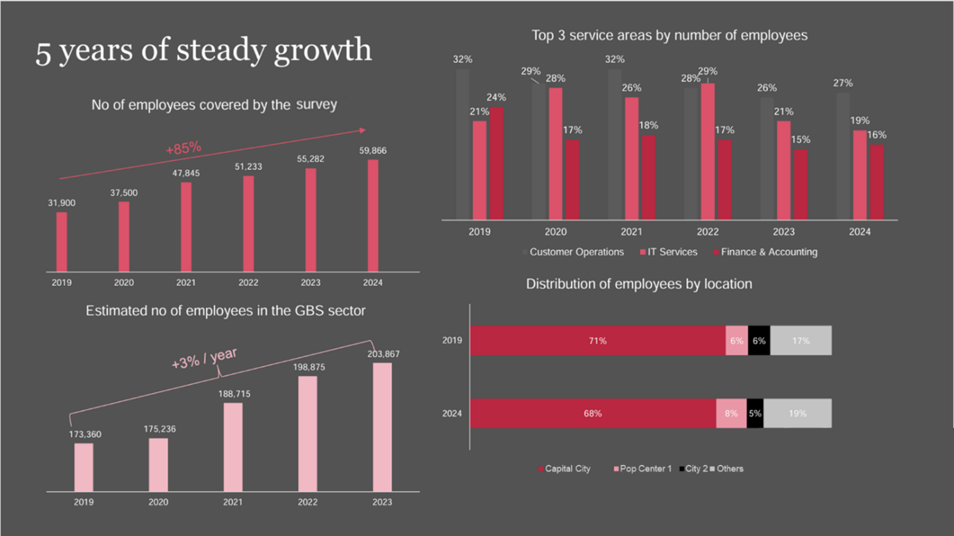
This is a real slide from a conference. No animation—pretty much just the way you see it here. During the presentation, it wasn’t immediately clear which chart was being discussed. And it was a large auditorium! I was 3/4 back in the audience and couldn’t read most of the text. And in the top right chart, “Top 3 service areas…”, many people miss the fact that there are 3 bars, since the 1st bar color closely matches the background.
So, how could this be better?

First of all, use higher contrasting colors. A white background may be “boring,” but it’s easier on the mind. And if you use a dark background, make sure all the elements are large, easily readable, and use light colors (highly contrasting colors).
The other important element is “What are you trying to convey.” Bar Charts are used for comparison. Line Charts are used for “change over time”. In the first slide, all 4 charts are actually looking at change over time. Therefore, the 3 simple bar charts should be line charts. The stacked bar chart also shows some change, but what it communicates is that the changes are small and that there is relative stability in where GBSs are located.
Another badly abused slide type is slides with text.[2]
Slides such as the one on the left are quite common. It is what Garr Reynolds calls a “slidument”—too much text to be a slide, but not quite enough to be a real document.
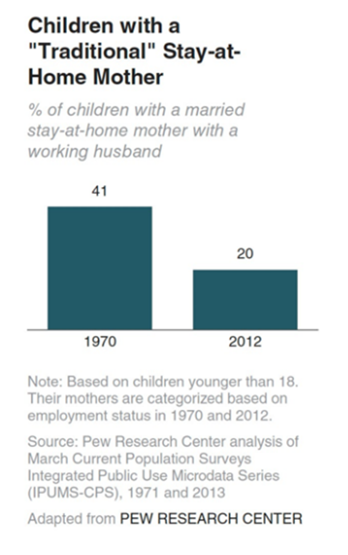
This slide exhibits 2 bad qualities: too much text and a completely wrong focus. The bar chart shows a change (a dramatic reduction), but the real message of the slide is more on the present than on the past. Some people fix this by reducing the text and making the most important message the focus, such as this:
The difficulty is in the fact that there is still a lot of text (of very small text). This text may be OK for a handout after your talk, yet, if you put it up on the screen during a conference or presentation, the audience is going to be focused on reading and understanding “the small print.” As a result, they may not be focused on what you’re saying and may miss your point.
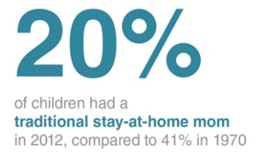
Here’s a solution:

Yes, it may seem too simple at first. So, please think for a second, “How long did it take me to see and digest that text, the ‘20%’?” In this case, the “20%” becomes a “gap of knowledge.” It goes up on the screen, and everyone is asking, “What 20%?” or “20% of what?” You immediately have their attention with minimal cognitive load. Now you can share that this is how many children in 2012 had a traditional stay-at-home mother (compared to 41% in 1970).
From here, you can move very smoothly into the consequences this has had on families and/or society, or on child development. The audience isn’t tired from reading what you have on the screen and are able to focus more cognitive resources on hearing your argument and thinking about how they can/should respond.
Finally, one of the most difficult slides to read (and one of the most common) is slides with tables.

Most of you reading this either skipped looking at those tables altogether (too much looking/thinking), or you wanted to put your finger to the screen to follow the columns and rows. Actually, most of you are pretty intelligent, and you’re able to just look at the tables and follow the information (unlike me). However, if these tables were 2x or 4x as large, you would probably need some help (like your finger) to follow them.
Something that can help with this is using a Heatmap.
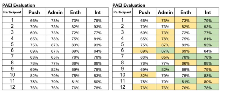
In this example, the green indicates the participants’ strongest character trait and the yellow indicates their 2nd strongest character trait. What becomes immediately apparent is that the participants of this evaluation lean heavily on Int (Integrator)—in other words they are, as a group, very relational. It is also apparent that they are weak in Push (Pusher), i.e., they do not have in the group very many people who are results driven and “push” others to get things done.
With this information, it is immediately obvious that the team/group needs to make some changes to ensure work is completed in a timely manner. They need to develop their “Pusher” skills or bring in some more people to help drive results.
To summarize, when making your slides for your data presentation, remember about the cognitive load your slide is putting on your audience. The lower the load, the more they will be able to focus on acting on your recommendations…and the higher the load, the more difficult it will be for them to act on what you want them to do. And getting people to act on the data is actually the point of your presentation, right?
Written by John Held
[1] Cognitive Load Theory – The Decision Lab
Decision fatigue – Wikipedia
[2] Example taken from Storytelling with Data: A Data Visualization Guide for Business Professionals by Cole Nussbaumer Knaflik.